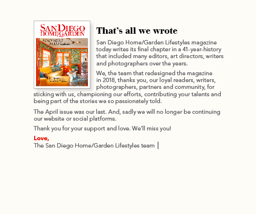
18th Annual Bathrooms of the Year
A balance of contrasts — contemporary alongside traditional, black juxtaposed with white, elegance combined with simplicity — amplifies the appeal of this year’s winning bathrooms.
 Feeling Groovy
Photography by Zack Benson
A petite, 55-inch, skirted tub pours cuteness all over a master bath designed by T racy Lynn Studio. But shiplap steals the day. The grooved horizontal panels fill the space with distinct cottage/farmhouse flavor. “I was dying to bring in shiplap,” says Shannon Weller, a designer at the studio. “Danielle Ruyak, our client, does one home project annually; and I’d been working on her Rancho Peñasquitos tract house for years. We had ‘cottaged up’ the downstairs with molding, millwork and fabrics. We had done wainscot and wallpaper, but hadn’t done shiplap. Since I wanted to pull that same feeling upstairs, the master bath was the perfect opportunity to use it. I didn’t know if I was going to do one wall or two, but I ended up doing the whole thing. That was my inspiration.” Ceramic flooring that looks like old, distressed wood planks ties in with the rustic aesthetic.“The flooring brings you back to an older time, and I love that look,” Danielle says.
Fixtures — including faucets mounted directly on the shiplap — bring a vintage feel. Shannon describes the tub’s handheld showerhead as looking like an old telephone. “The old-style star knobs at the tub, sinks and shower have white porcelain index buttons that say ‘hot’ on one side and ‘cold’ on the other,” she says. Elegance trickles in with silverleaf-finished mirror frames, pewter cabinetry hardware, brushed-nickel sconces, and snow white vessel sinks atop a marble countertop. Shannon also used marble in the shower. “The perimeter is white subway tile. But to bring in color and texture, I created ‘window boxes’ with Calacatta marble in a herringbone pattern,” she says. “There had to be a little punch in there — not just white tile and white shiplap.” “The whole bathroom feels very feminine to me,” Danielle says. “It is soft, timeless and classic. You walk in and let out a big sigh, because it is so calming and so pretty.
Reigning Wet and Dry
Photography by Matthew Meier

The sun pours in like honey over milk from large skylights in a spacious, airy master bathroom that was part of a La Jolla home remodel.
“The original house had numerous angles to it,” winner Ione Stiegler of IS Architecture says. “The obtuse angles in the master bath paved the way for wet and dry compartments — an idea that our office has been enamored of for awhile.” Equipped with rainfall showerhead fixtures, his-and-her showers merge with a built-in tub directly across the way. They make up the wet section. On each side, eye-catching, glass-tiled niches nestle within porcelain-tile walls to add a layer of depth. “The porcelain tile has tone-on-tone, white/off-white and pale gray, horizontal striations,” Ione says. “The vertical glass tiles emulate those striations and bring in a bit of gloss to play against the porcelain surface.”
A heated limestone floor flows seamlessly between the wet and dry areas. Clear-glass partitions top a porcelain pony wall that separates the sections. Aluminum trim imparts a crisp finish along its edges. A bench rests against the wall and faces the dry compartment’s prime asset: a custom-built, mahogany alcove that houses the vanity. “The vanity’s frame provides an opportunity for concealed medicine cabinets on each side,” Ione says. “Mirrors cleanly finish the look between the backsplash and the wood framing.” Glass tiling alongside each
mirror echoes tile in shower and bath niches. The countertop’s cream white Caesarstone complements porcelain tile elsewhere. Both assure continuity between the wet and dry areas. The alcove’s rich mahogany, on the other hand, adds bold contrast while remaining true to the room’s serene aesthetic.“The master bath cohesively blends with the rest of the remodel project, which can be described as woodsy modern,” Ione says. “Elements of warmth are brought in with the mahogany, and clean lines speak to a modern aesthetic. All in all, the combined effect of the room is a calming, luxurious experience.”
 What Style!
Photography by Chipper Hatter
Hollywood regent? Gatsby-like? Traditional? Modern? It’s difficult to pinpoint the exact style of this downtown bathroom designed by Corine Maggio of CM Natural Designs. “Everyone sees this space through the lens they want. It fits so many styles,” she says. “Because of that, I feel we struck the balance of a bold yet timeless design.” Homeowners Alison and Shaun Ericson wanted their cookie-cutter bathroom to have character, be beautiful and make a statement while still feeling classic. Going black and white with antique brass accents did the trick. “Black and white can become blocky,” Corine says. “So careful thought was put into where there would be contrast, texture and tone and how it would all be kept in balance. We wanted elements that would be familiar yet novel.” The shower is a case in point. The 1920s-style, black-and-white, hexagon-patterned flooring brings in the familiar. The subway tile on the wall hearkens back to something older, but its elongated arrangement says “modern.” And, then, for something completely different, there’s the black-framed glass shower partition. “We went back and forth about having a sliding door versus a partition,” Alison says. “But looking back now, we feel that the partition is what makes our bathroom so dramatic. The highlight is the shower. It definitely has a wow factor. The pendant lights are another one of my favorite aspects of the design. They really pull the whole look together.”
Pendant lights, mirrors and cabinetry hardware introduce antique brass. The material was used subtly to add an accent without “screaming trendiness, because that is one way to make a bathroom look dated fast,” Corine says. The circular shape of the pendant lights — the most decorative pieces in the space — mimics the round mirrors. Both add a little femininity to balance hard-edged elements. “Our bathroom is bold yet simplistic, classic and modern,” Alison says. “It beautifully captures an industrial yet polished look. We love it.”
Grand Illusion
Photography by Martin Mann
 The heaviness of Tuscan style weighed down this small Del Mar bathroom. But Roni Lechtenberg of RDSGN Interiors had tricks up her remodel sleeve to lighten the load and make the space feel much bigger than its 9-foot-by-10-foot size. “Floating cabinetry, horizontal tiling, a raised ceiling and the use of glass give the illusion of spaciousness,” she says. Updated materials also help achieve the more modern, sleeker aesthetic of the rest of the home. T ile clads every wall. Outside of the shower, Italian, carved limestone tiles set in a wave pattern mimic the Pacific Ocean, which the house overlooks. The combination of polished and honed stone — another trick — creates a softer look for a hard material. Glass tiles line the shower. Installed vertically, they lead the eye toward the vaulted ceiling. “We wanted to define the shower without pigeonholing it, so we wrapped the entire area with glass that was custom made for us,” homeowner Steve Sinclair says. “The colors were coordinated with the wave wall.” Marble adds elegance in mosaic shower flooring, the 12-foot-by-24-foot field tile and countertop slabs. California black walnut surrounds the double-sink vanity and the makeup table. Its medley of rich yet subtly blended colors brings in warmth and movement that varies from the wave tile’s dance. “The combination of materials highlights the bathroom,” Roni says. “It’s amazing that in such a small space we were able to use so many different elements and finishes and still make it feel really open.” “Roni gave us a bathroom that is modern, clean lined and bright,” Steve adds. “It’s so sophisticated. It feels like a New York penthouse.”